
Leos Zapieksy Street Food Brand Identity
Bold · Playful · Memorable
Leoś Zapieksy is a neighborhood food spot serving one of Poland’s most iconic street foods: zapiekanka. The challenge was to create a brand that feels friendly, approachable, and memorable while standing out in a busy urban environment.
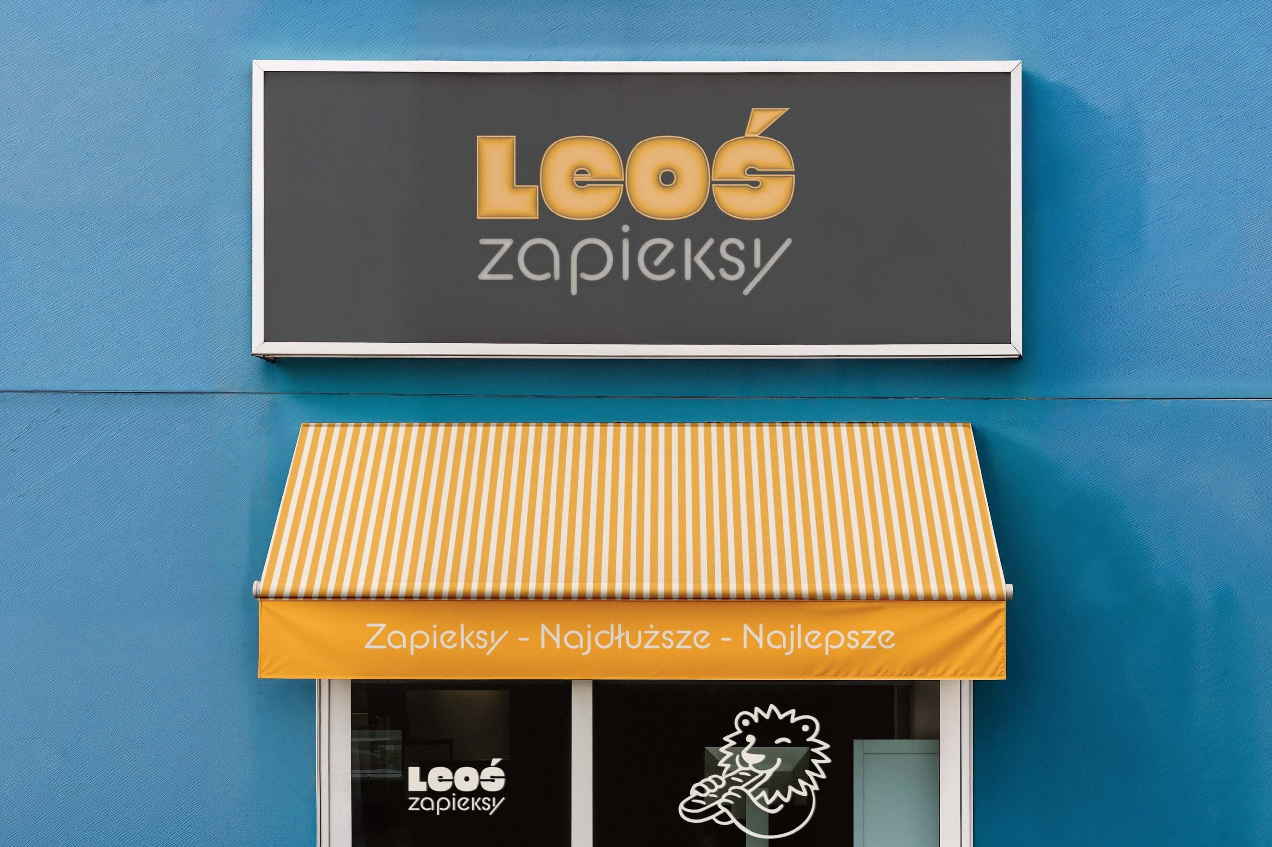
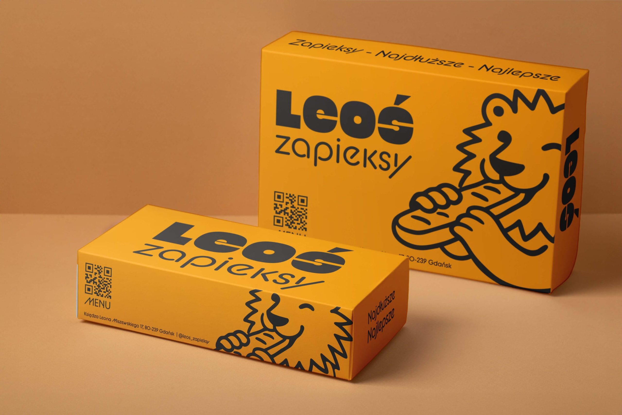
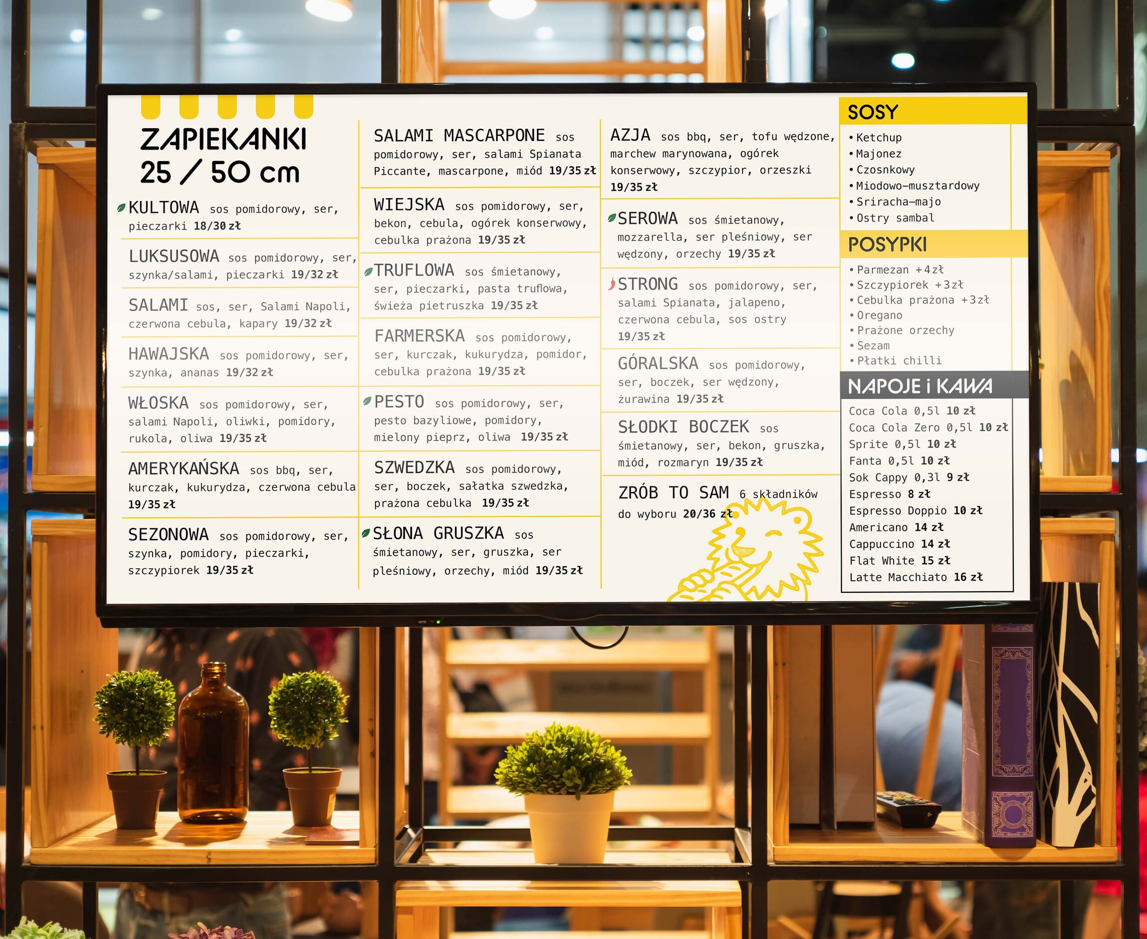
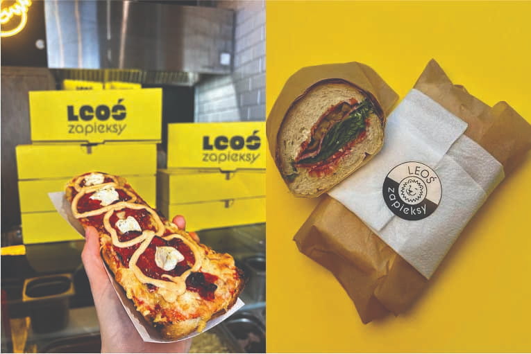
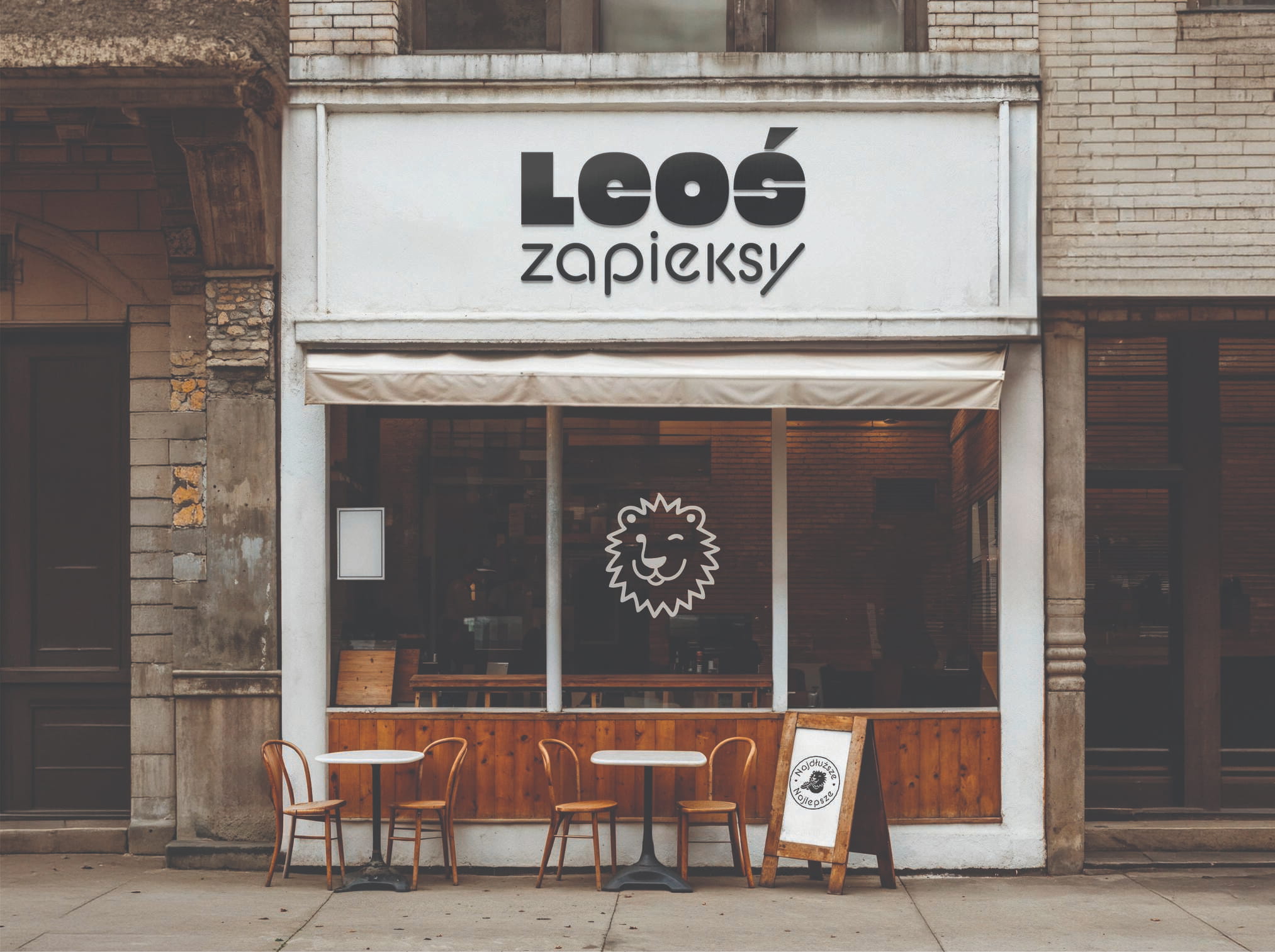
From the beginning, the focus was not on creating a logo that only works on a presentation slide. The owner wanted a visual identity that performs in real life – on storefront signage, packaging, takeaway materials, menus, social media, and everything customers interact with every day.
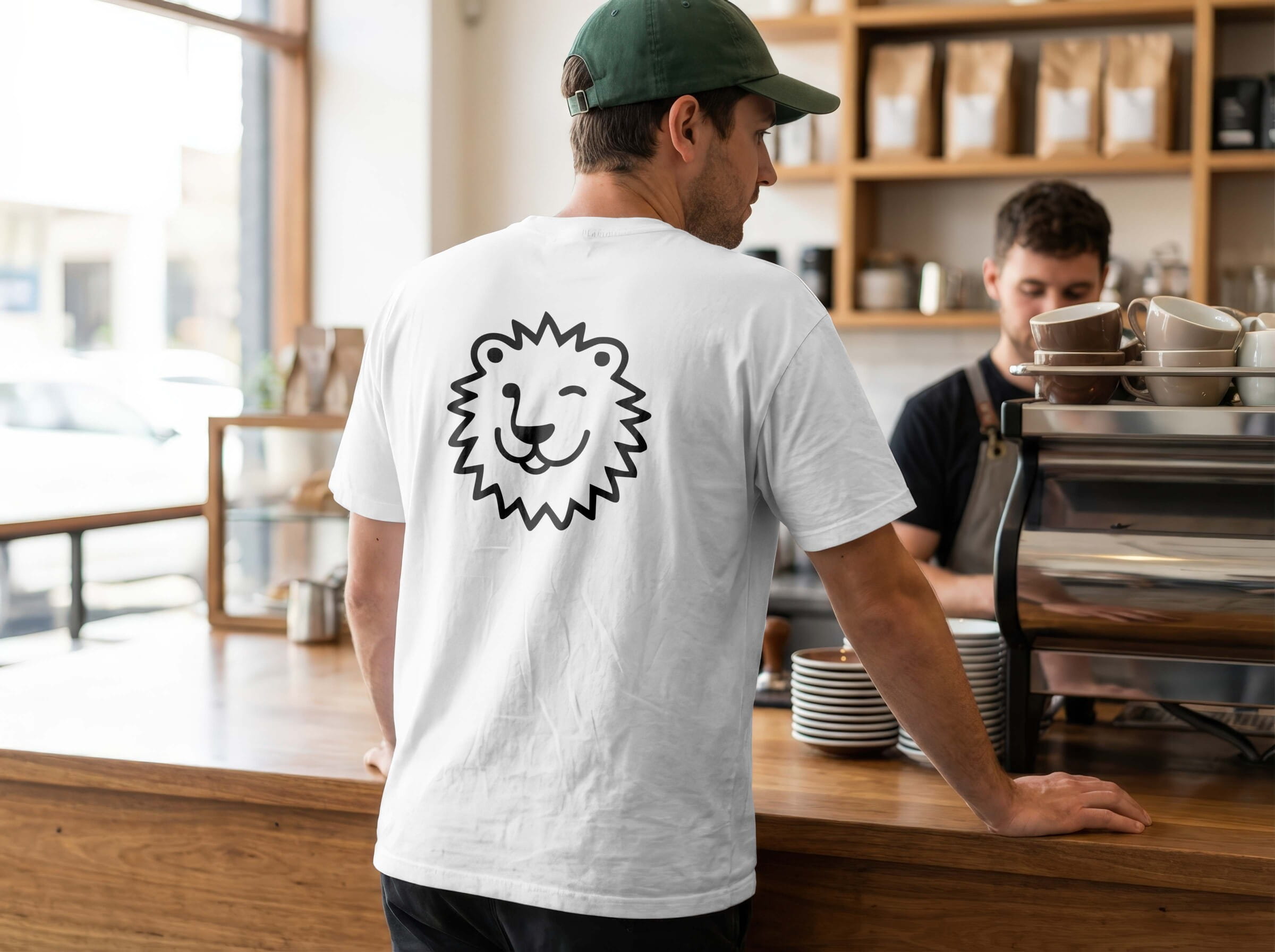
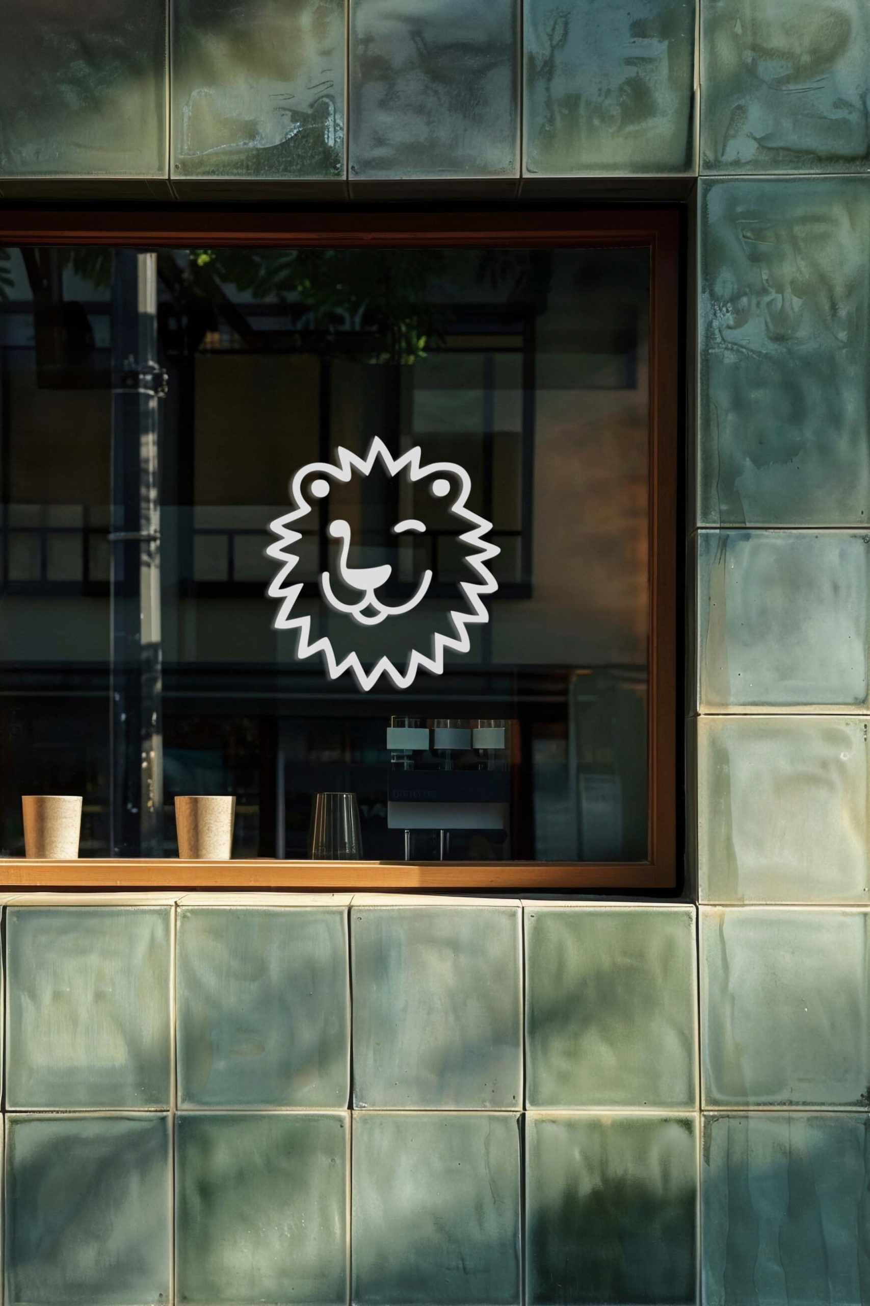
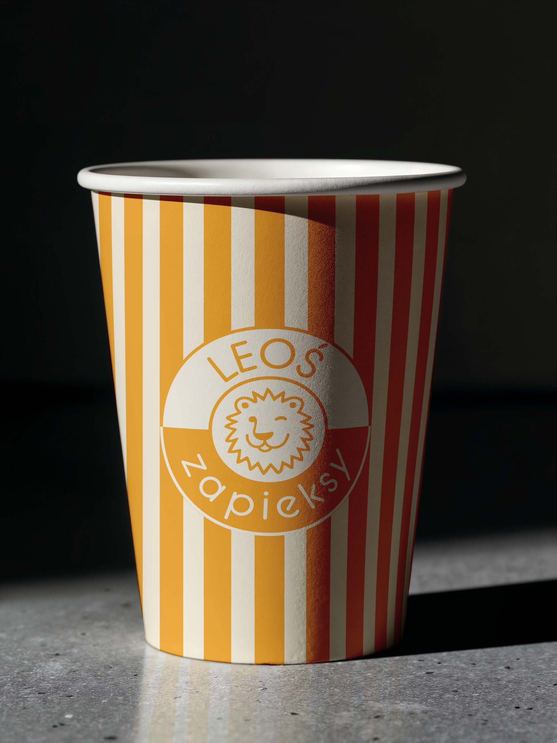
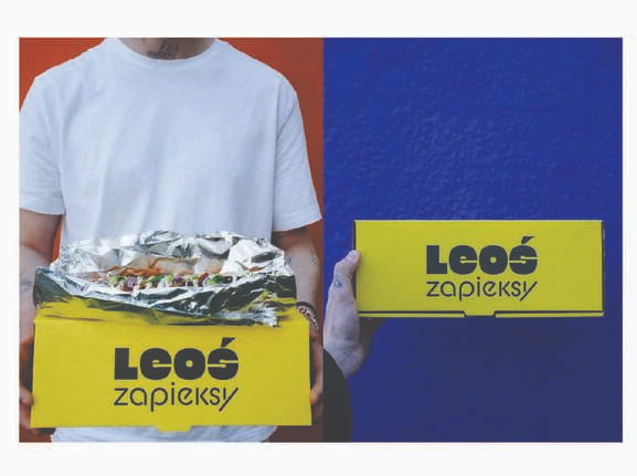
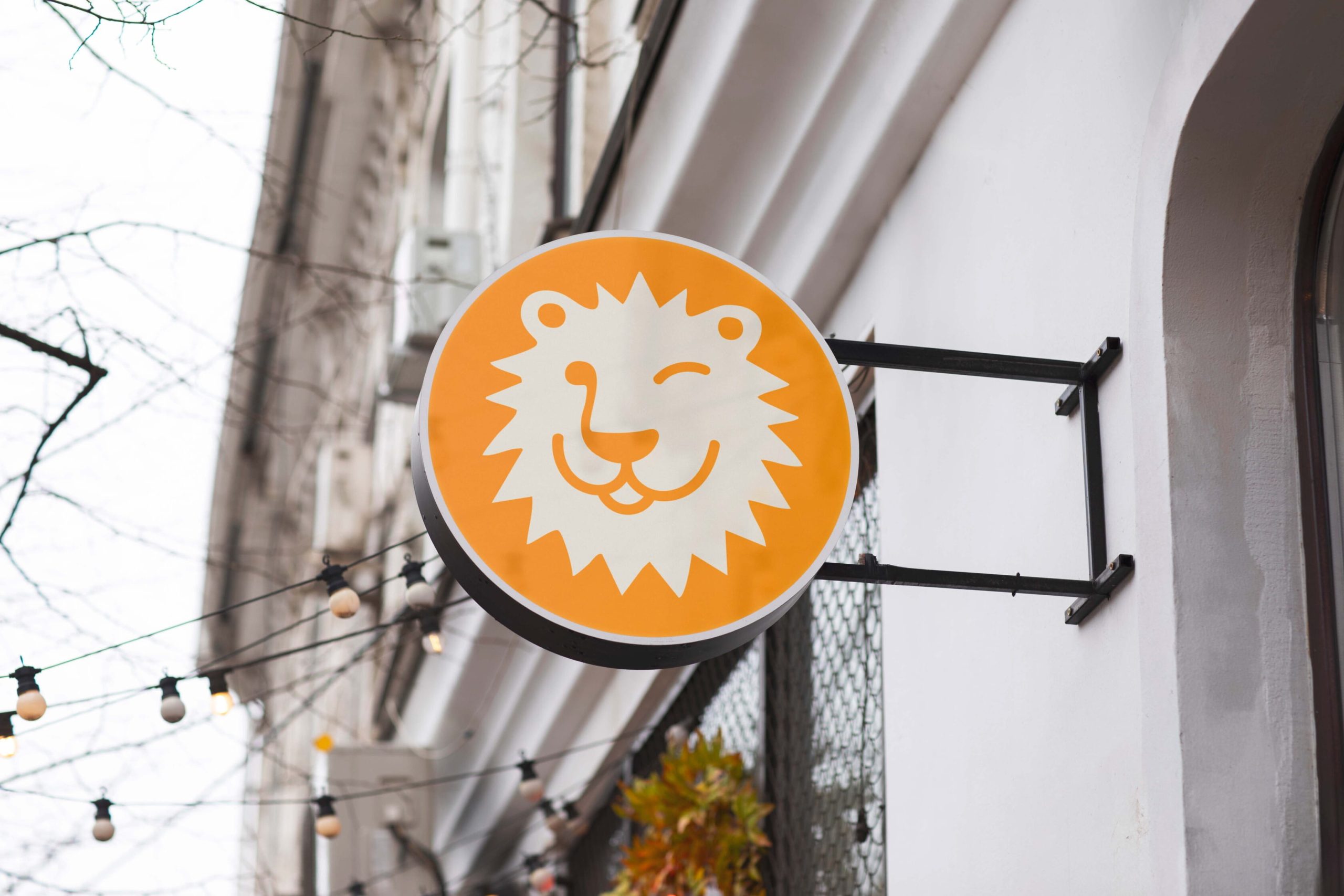
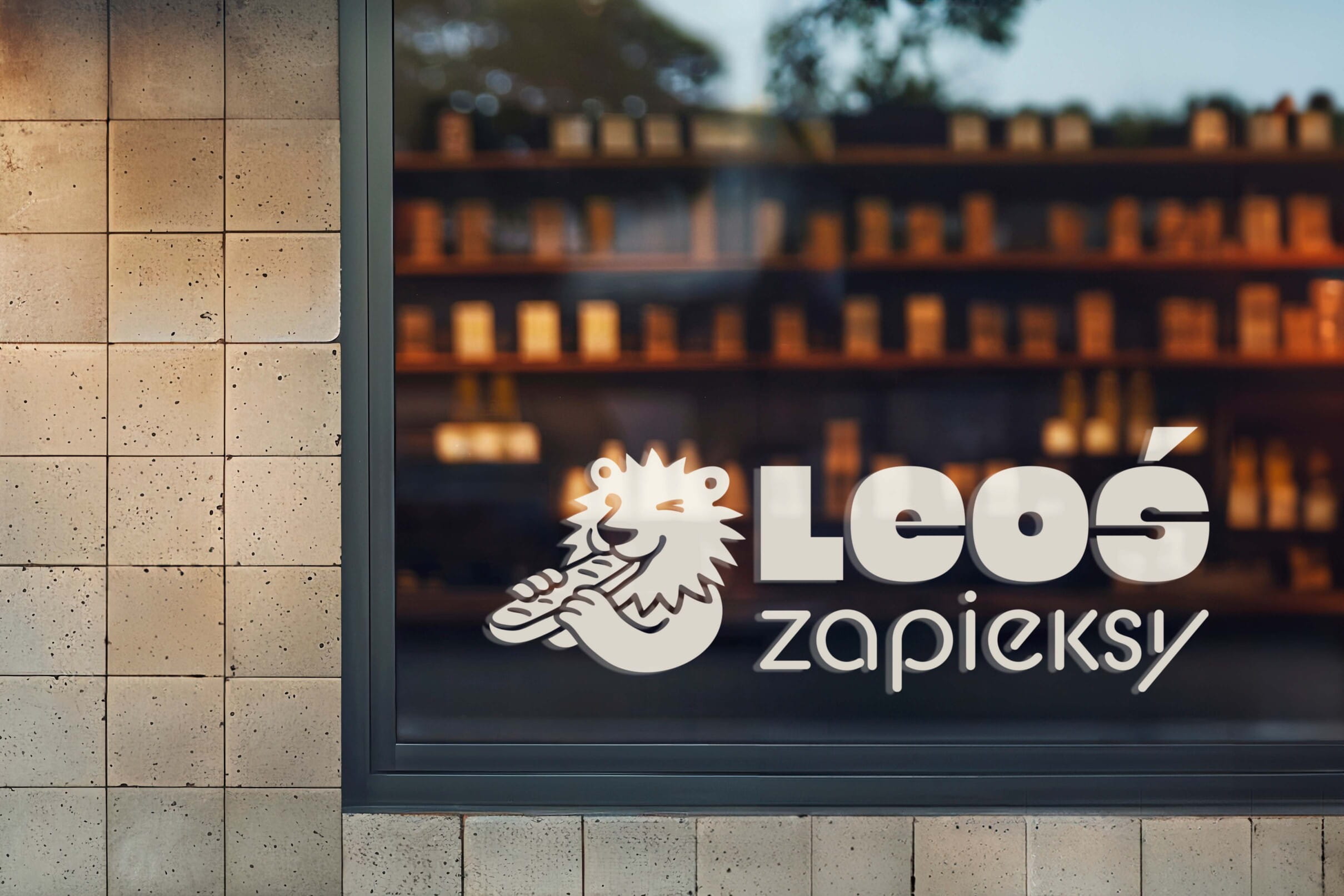
The solution combines a bold, highly legible wordmark with a playful lion mascot inspired by the restaurant’s name. A vibrant yellow color palette was chosen to maximize visibility and create strong recognition both on the street and across branded materials.
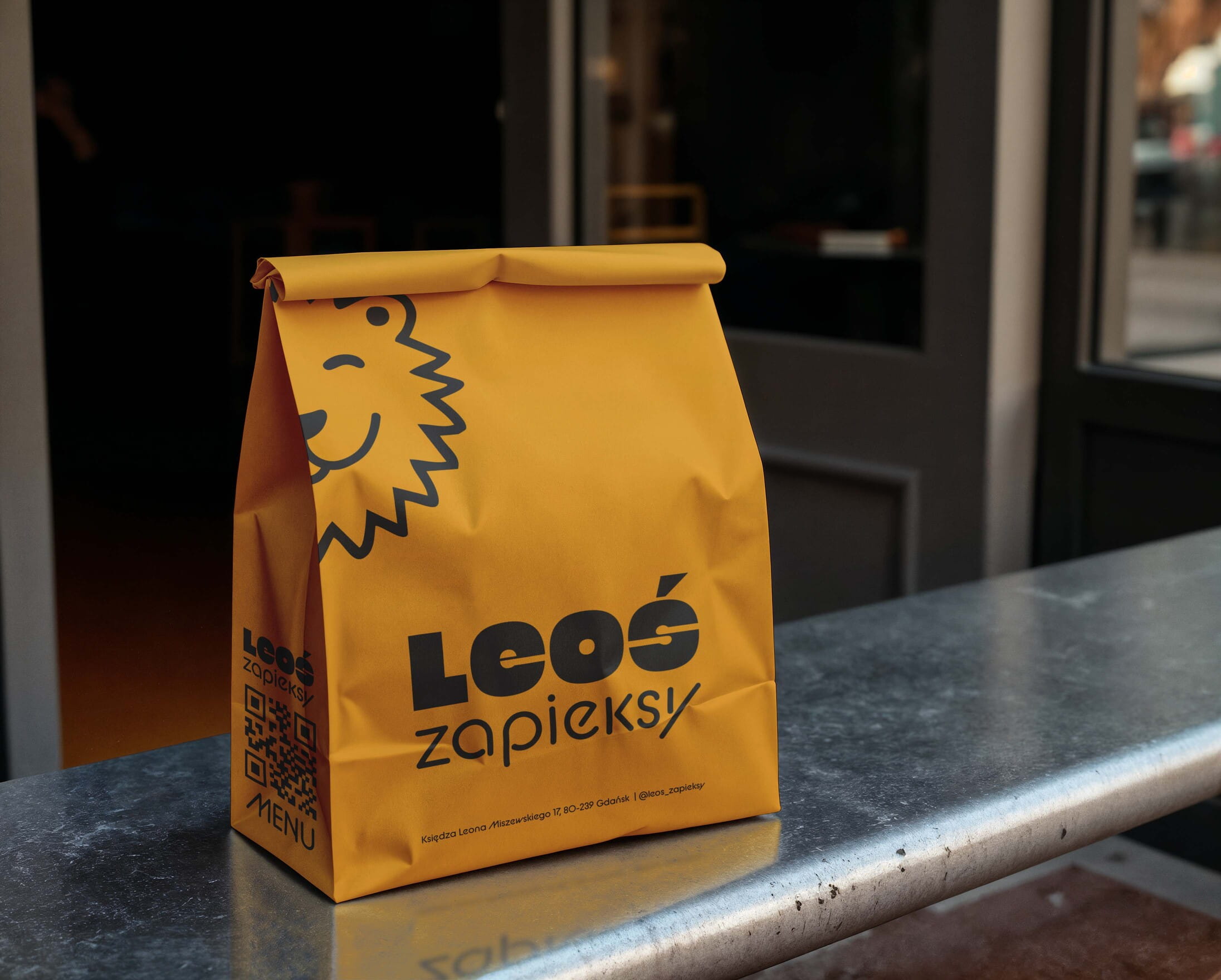
Every element was designed with practical application in mind. The logo remains readable from a distance, the signage attracts attention in a busy streetscape, and the packaging turns every takeaway order into a moving advertisement for the brand.
The result is a simple but distinctive identity that helps Leoś Zapieksy look consistent, recognizable, and memorable wherever customers encounter it – proving that successful branding is not only about looking good online, but about working effectively in the real world.


Other Projects


Back to Portfolio →
Ready to make your venue the talk of the town?
Book a free consultation call

Copyright © 2026 Pineapple Studio. All Rights Reserved.